Dark UX: Scary Design Mistakes That Haunt Users
Not all horrors happen in dark alleys — some hide behind shiny buttons and smooth animations. A great interface feels invisible — it quietly helps users get where they want to go. But when things go wrong, when the design turns from friendly to frustrating… that’s when Dark UX awakens. These are not just bugs — they’re curses that make users rage-quit, leave bad reviews, and never return. Let’s shine a flashlight on the scariest UI/UX design mistakes that still haunt designers — and how to banish them for good. At ELDEVELOP , we make sure these UI/UX design nightmares never see the light of day. Our team carefully crafts every interface, avoiding confusing layouts, misleading buttons, and broken flows — so users feel guided, not lost. Because good UI/UX design isn’t about tricks — it’s about trust.
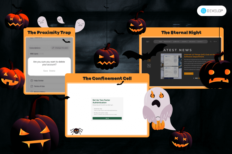
1. “Delete” and “Save” — side by side. Few things are more terrifying than losing everything with a single click. Placing destructive and positive actions next to each other without confirmation is design negligence. It’s like handing users a self-destruct button labeled “Oops.”
Fix it: Separate critical actions visually and spatially. Add confirmation steps and color contrast (red is your friend here).
2. The modal that won’t let you go. A popup without an escape button is the digital version of a haunted room. You try to leave — but there’s no “Close,” no “X,” no mercy.
Fix it: Always provide clear exits — “Close,” “Cancel,” or an obvious gesture. Trapping users never improves engagement; it only raises their heart rate.
3. The unbreakable Dark Mode. Dark Mode is a fan favorite — until it’s forced upon you forever. Some apps lock users in eternal night with no toggle back to the light. Accessibility suffers, legibility drops, and the user feels like a vampire victim.
Fix it: Give control. Let users choose between light, dark, or system default. Choice is the true magic spell of good UX.
Crafting Inclusive Interfaces: Building Accessible Designs for All
4. Invisible navigation. Sleek minimalism often turns into mystery. If users can’t tell where they are or how to get back, you’ve designed confusion — not clarity.
Fix it: Use consistent menus, breadcrumbs, and visual cues. Navigation should feel like a map, not a maze.
5. Overloaded onboarding. Nothing drains excitement faster than a 12-step tutorial before the first action. Users came to explore — not to read an encyclopedia.
Fix it: Guide through action, not explanation. Show value first; teach features as users encounter them.
6. Jump-scare notifications. Push notifications that pop up too often or too loudly — that’s pure horror. They don’t engage; they haunt.
Fix it: Respect timing, frequency, and context. Notify users like a friendly ghost, not a banshee.
The Impact of AI on UX/UI Design
7. Microtext gone wrong. Error messages like “Something went wrong” tell users nothing. Ambiguous labels like “OK” or “Continue” leave them guessing — and that’s UX limbo.
Fix it: Be human, not robotic. Tell users what happened and what to do next. Clarity is your silver bullet.
8. The cursed checkout. Users add everything to the cart… and then face a labyrinth of extra steps, hidden fees, and account creation walls. That’s not onboarding — that’s a ritual sacrifice of conversions.
Fix it: Simplify checkout. Transparency and trust are your best design charms.
The Moral of the Story
Great UX is invisible — but bad UX lingers like a ghost. When interfaces confuse, frustrate, or trap users, they don’t just cause inconvenience — they break trust. So this Halloween, don’t just wear dark colors — banish Dark UX from your designs. Make your interfaces kind, predictable, and forgiving. Because nothing scares users more than feeling lost, helpless… or one click away from disaster.