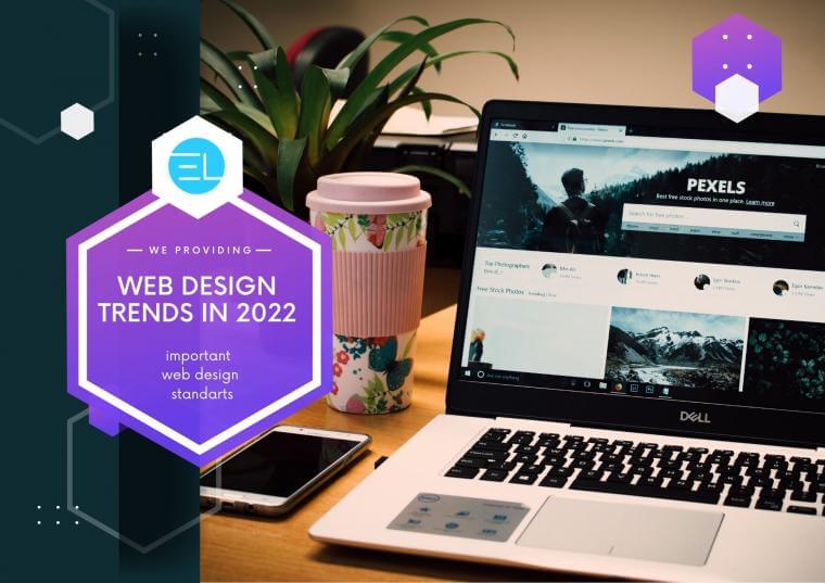
Web Design Trends to Expect in 2022
The process of popularizing dark web design types began in 2019. Sometimes it seems that the typography on websites is getting bigger every day. The so-called text gigantism has burst into trends, when very large headings are used on website pages. And this is logical, because the headline is what users pay attention to in the first place. Dark design trends were aimed at adapting the style site trends and giving it an excellent appearance.
Used to highlight headings or important information on a page. Graphic and web designers collaborate to create original font variants that:
What are some top tools and technologies used in IT services?
• the site is unique;
• important information attracts attention;
• design has aesthetic value.
An example of such a design is letters with serifs and curls, as well as lettering, in which letters of different heights are used in one word. Microsoft also decided to modernize the fonts. Five new fonts will appear in the Microsoft Office suite in 2022: Grandview, Skeena, Bierstadt, Seaford, Tenorite. The popularity of this future of web designing is ensured by obtaining a number of positive aspects: it supports ecommerce design trends.
Ordering Website Designs: What’s Required for Different Types
Asymmetric mesh
The grid in web design determines the weight of an object within a composition. An asymmetric grid implies an unequal weight of objects that balance each other within the entire composition. Heavy elements are replaced by light and elegant ones, due to which the site turns out to be more lively, dynamic, and interesting.
The use of the dark theme in web design studio is controlled manually using the settings. Despite the fact that this design option is no longer so new, it will still be used in 2022 design trends. Using an asymmetric grid, the designer places several accents within one composition, and also makes better use of the page space: with a classic layout, the site will be longer and often harder to perceive.


