Creating High-Converting Landing Page UI/UX Design
In the world of digital marketing, your landing page UI/UX design can make or break a campaign. It’s your first impression, your digital handshake, and—most importantly—your silent sales rep. So how do you make sure your landing page doesn’t just look good, but actually performs?
Let’s break it down. A landing page is a standalone web page created specifically for marketing or advertising purposes. Visitors typically land on it after clicking an ad, email link, or social media promotion. The core of a high-converting landing page lies in how seamlessly it blends form and function.
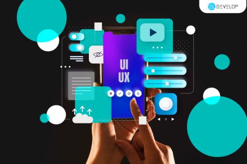
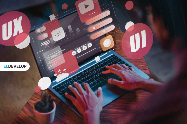
Aesthetics, or the UI (User Interface), play a massive role in catching the user’s eye and keeping their attention. Everything from the color palette to the typography, button design, imagery, and spacing sends a visual message. But that’s only part of the equation. Behind every well-designed interface is a UX (User Experience) strategy — the invisible logic that determines how intuitive, frictionless, and satisfying the journey feels. When we talk about UI/UX design landing page success, we’re really talking about how well your page connects those visual cues with human behavior and motivation.
A high-converting landing page is often incredibly simple on the surface, but meticulously thought-out behind the scenes. It starts with a strong, benefit-driven headline that speaks directly to the user's need or pain point. This is typically followed by a hero section — a visually striking space that combines impactful imagery or video with a clear value proposition and a call-to-action that leaves no room for doubt. The CTA button should be highly visible, emotionally engaging, and action-oriented. “Start Free Trial,” “Get Instant Access,” “Download Now” — these aren’t just words, they’re invitations.
Everything on the page should support that central goal. Whether it's product benefits, key features, or limited-time offers, the content must be concise, relevant, and structured in a way that naturally leads the user toward conversion. Visual hierarchy is crucial here. Through careful sizing, spacing, and color contrasts, a well-executed landing page UI/UX design subtly tells the user where to look first, second, and third. You’re not just showing information — you’re directing attention.

Equally important is trust. Social proof in the form of testimonials, client logos, star ratings, or user counts can dramatically increase credibility. Users want to know that others have tried your product or service and found value in it. Reinforce that with trust badges, secure checkout icons, and privacy reassurances — especially if you're asking for personal data.
Ordering Website Designs: What’s Required for Different Types
A crucial, often overlooked part of the UI/UX design landing page experience is how well it performs on mobile devices. With the majority of web traffic now coming from smartphones, your landing page needs to be responsive, fast, and thumb-friendly. Buttons should be large enough to tap easily, content should load without delay, and forms must be as short and streamlined as possible. Every extra field or loading second is a potential exit point.
Form design, in particular, is where many landing pages lose their users. Keep your forms as short as humanly possible — ask only what you absolutely need. When users feel overwhelmed or suspicious of giving too much information, they leave. On the other hand, clear labels, autofill, progress indicators, and smart error messages can greatly enhance the user experience and increase completion rates.
Finally, let’s talk about emotional engagement. Small UI details like hover effects, button animations, or subtle motion graphics can add personality and confidence to your page. They make your brand feel alive and responsive. But moderation is key — every element should serve a purpose. If it distracts from the CTA or slows the page down, it’s hurting your conversions, not helping them.
Must-Have Elements of a High-Converting Landing Page
Here's your conversion toolkit:
-
Headline that hooks: Clear and value-driven.
-
Hero section: Strong visuals + core message.
RelatedCore Mobile UI/UX Design Principles Every Designer Should Know
-
Benefits list: Why should the user care?
-
Social proof: Testimonials, reviews, or logos.
-
Call to action (CTA): Make it bold, direct, and benefit-focused.
-
Trust signals: Secure badges, privacy notes, guarantees.
Remember: everything on the page should push toward a single goal.
Creating a high-converting landing page UI/UX design isn’t just about looking pretty. It’s about making sure every pixel, word, and interaction pushes users toward action—without resistance, confusion, or distraction.
If you combine smart psychology, clean visuals, and data-driven tweaks, your UI/UX design landing page won’t just get views—it'll get results.